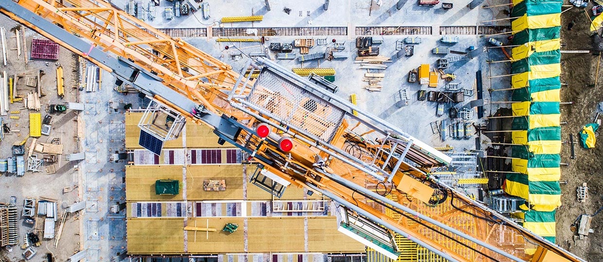
Essential Land is a property development business focused on unlocking complex urban sites through planning, partnership & development expertise.
The challenge
Essential Land needed a refreshed identity that better reflected the business it had become.
The partners, Martin, Darryl & Scott, had strong experience across residential development, land, planning & regeneration, but the existing brand no longer gave the business the clarity or presence it needed.
Martin approached us to create a new look & feel for Essential Land, starting with the logo & then carrying that identity through into a new website, business cards, LinkedIn presence & email signatures.
The project needed to:
- Clarify what Essential Land does
- Create a stronger visual identity
- Develop a professional new logo
- Design & build a modern website
- Bring the wider brand system to life
- Create consistent assets across key touchpoints
What we did
We delivered a complete brand refresh for Essential Land, covering logo design, website design & the supporting materials needed to make the new identity work in practice.
Brand definition
Before moving into design, we worked with Martin to define what Essential Land is & what the business does.
This helped us move beyond surface-level design preferences & create a clearer creative direction rooted in the business itself.
We developed a list of brand words that captured Essential Land’s role, personality & value in the property sector. This gave the design process a useful blueprint & made sure the visual identity was connected to the substance of the business.
- Defined the business proposition
- Explored the role of Essential Land in the market
- Created brand words to guide the design process
- Built a clear creative foundation before sketching began
Logo exploration
The logo process started with pencil & paper.
Inspired by a more hands-on design process, we sketched a wide range of possible logo ideas before narrowing them down to the strongest concepts.
From those initial sketches, we selected 9 options to present to Martin, along with the thinking behind each route.
- Explored multiple logo directions by hand
- Shortlisted 9 concepts for review
- Presented each option with clear rationale
- Worked collaboratively to choose the strongest routes
Martin & the team then selected 3 concepts to move into the next stage.
Logo refinement
The 3 chosen concepts were developed into more complete logo lockups, paired with logotypes & early colour routes.
This stage allowed the team to see how each idea could work as a proper brand identity, rather than just a sketch or isolated mark.
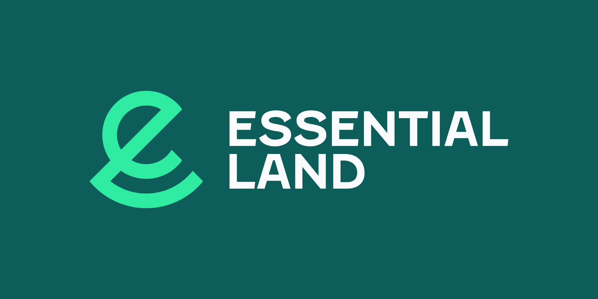
The selected route was a creatively combined E & L mark, giving Essential Land a simple, ownable logo that connected directly to the business name.
- Developed 3 concepts into polished logo routes
- Created logo lockups with supporting typography
- Introduced colour options
- Finalised a combined E & L logo mark
Website design & build
Once the logo was complete, we moved into website design.
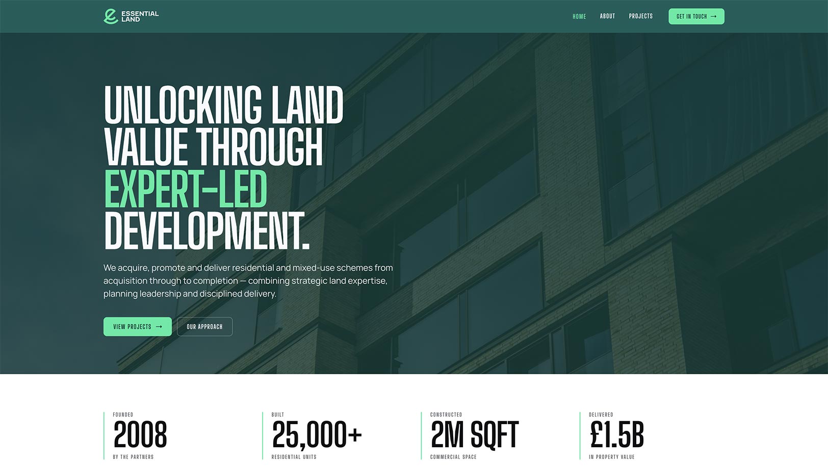
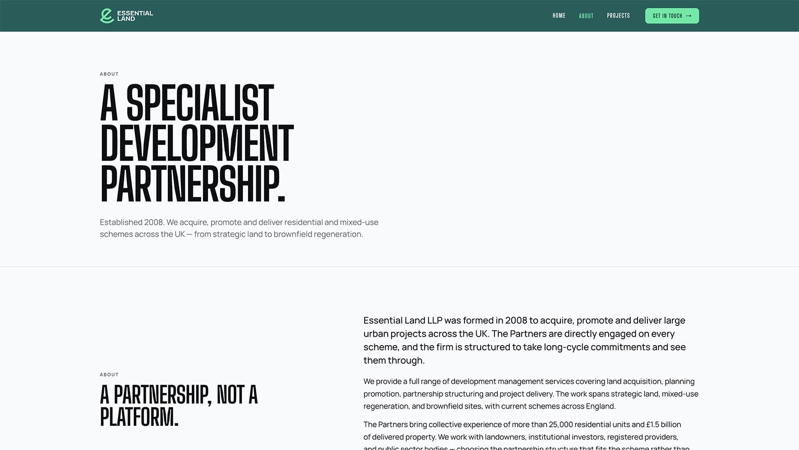
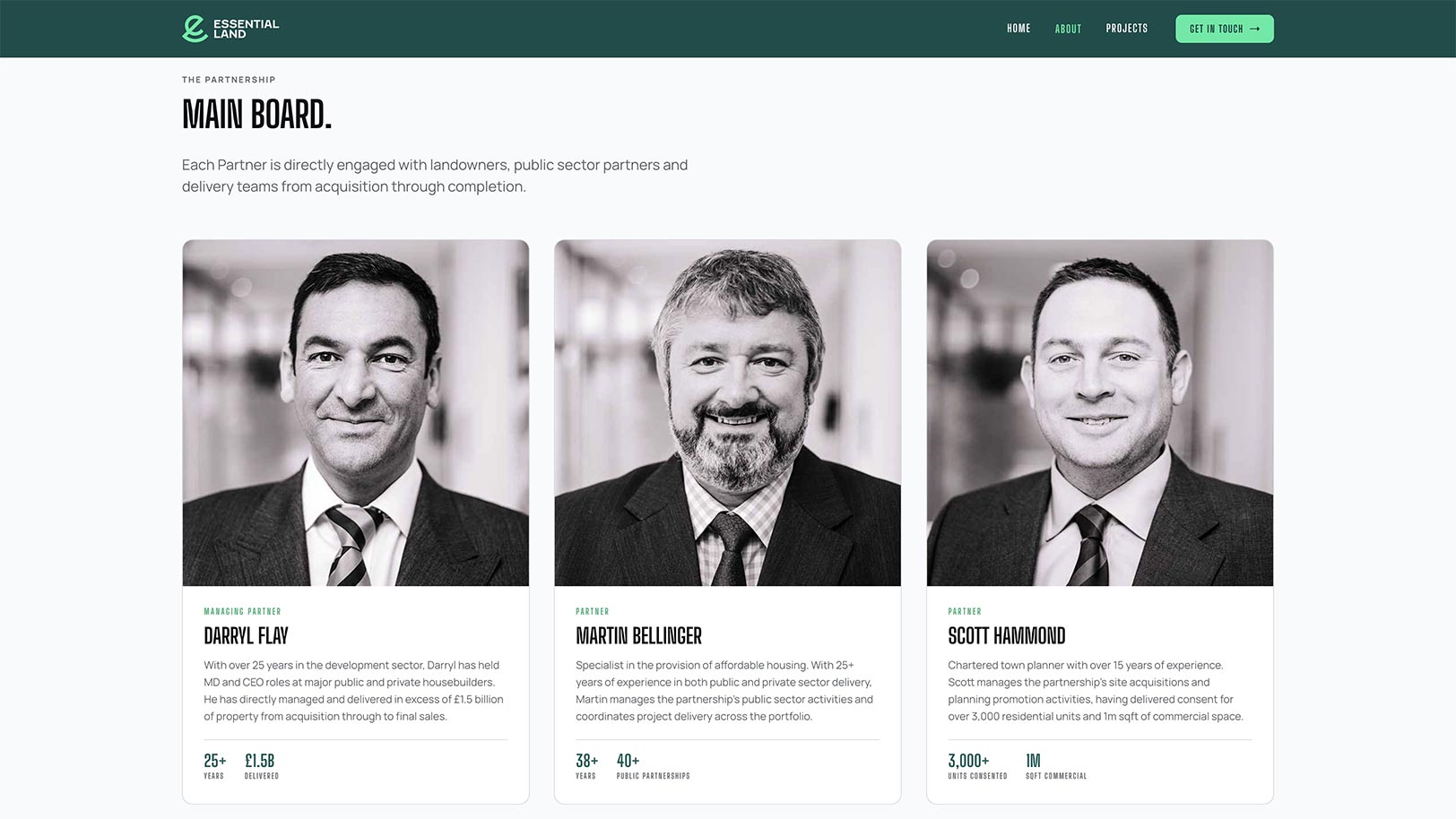
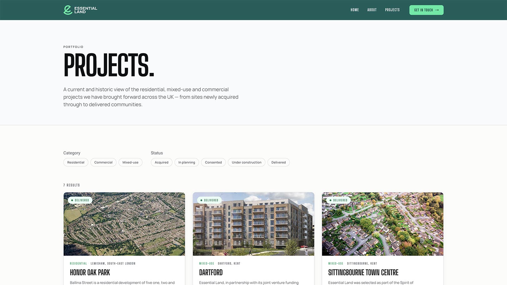
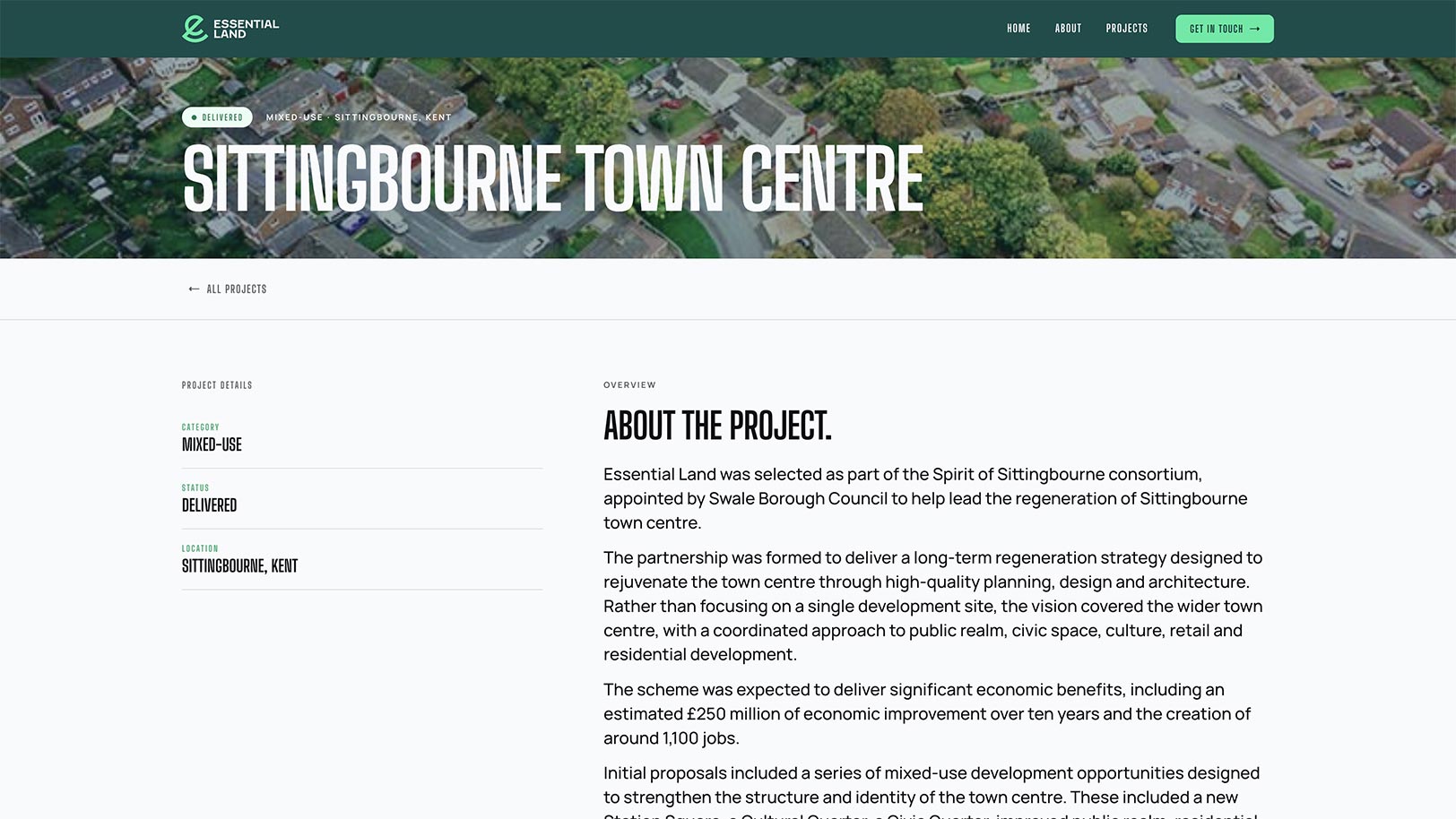
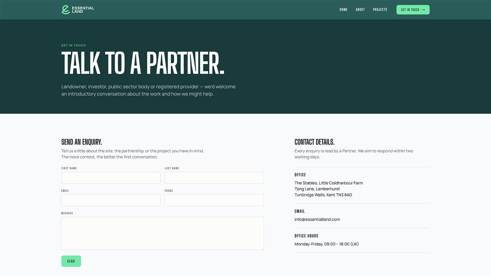
We designed & built a fully functioning website that clearly showcased what Essential Land does, the projects it works on & the experience behind the business.
The website also gave us the opportunity to bring the wider brand identity to life, including fonts, colours, layout style & supporting visual decisions.
- Designed & built a new website
- Showcased the business proposition clearly
- Created project-led content sections
- Defined fonts, colours & wider styling
- Built a stronger digital presence for the brand
Supporting brand materials
To make the new identity usable beyond the website, we created supporting brand assets for the team.
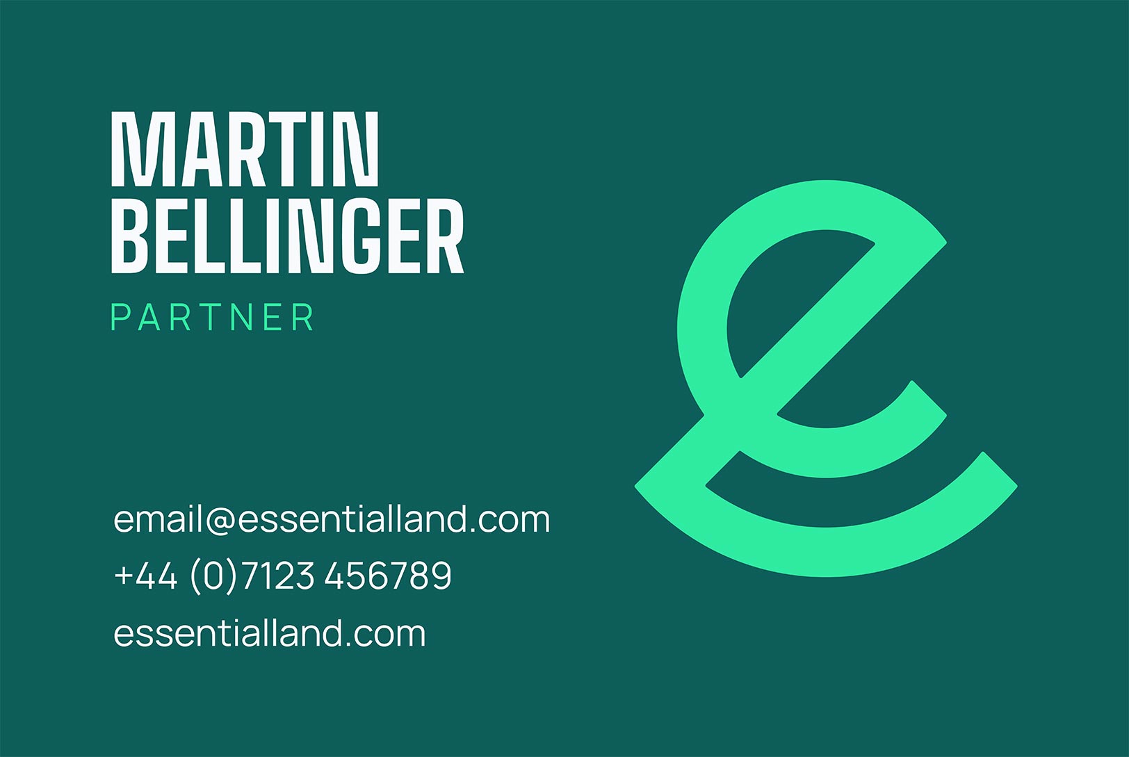
This included business cards, printed via Moo, as well as support bringing Essential Land’s LinkedIn presence & email signatures in line with the refreshed brand.
- Designed business cards
- Supported print production through Moo
- Updated LinkedIn brand presentation
- Created on-brand email signature guidance
The outcome
Essential Land now has a refreshed brand identity & website that better reflect the quality, experience & ambition of the business.
The project gave the company a clearer visual presence, a more professional website & a consistent set of assets that can be used across digital, print & day-to-day communication.
The project delivered:
- A new Essential Land logo
- A complete visual identity refresh
- A fully functioning website
- Business cards & supporting brand assets
- Consistent LinkedIn & email signature styling
Most importantly, Essential Land now has a brand that feels sharper, more confident & better aligned with the work it does across complex urban development opportunities.